Work Allredi
Two rivals in the industrial supply sector decided to join forces. They knew that integrating the people and systems from both companies would be a tough task, with many strong opinions to consider. We helped them unite under a dynamic new brand.
Competitors to Compatriots
For many years, Marco and APE Companies had fiercely competed in the industrial abrasives, blasting and safety products sectors. In 2020, both companies determined that they could be stronger as one. Rather than recycle remnants of either company’s brand, they decided to start fresh. Together. That’s where we came in. BrandExtract conceived and built a wholly new brand and helped the company launch it to great fanfare and success, despite COVID challenges.
- Website
- Location
- HQ in Pasadena, TX, with large North American network
- Industry
-
- Energy
- Services Offered
-
- Strategy
- Marketing
- Branding
- Digital
Uniting Rivals Under a New Brand
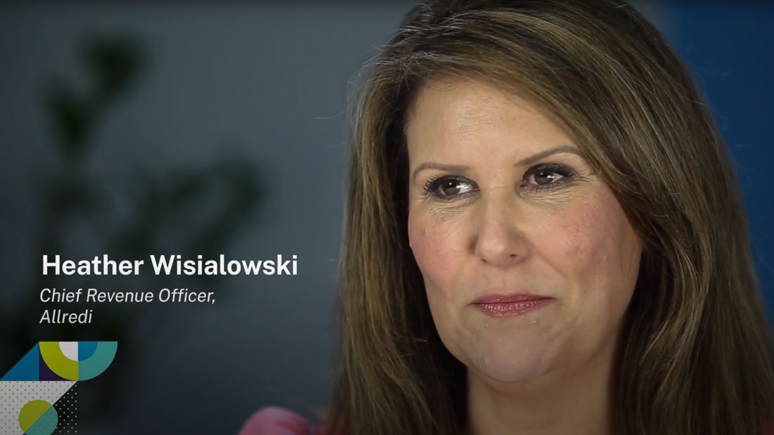
The APE and Marco teams needed a whole new identity that they both could embrace. Hear how we created the Allredi brand to unify the team and signify that a new market leader was in town.
New Discoveries
Over the years, BrandExtract has helped many clients navigate the precarious path of M&A activities. In this case, we knew that branding would play a starring role in ensuring a smooth integration of the two companies. It was critical that we develop a brand that did not favor either legacy company. So we set about learning everything there was to know about both. After extensive research and interviews, we emerged from the discovery phase with a branding strategy that would set up the newly merged company for assimilation success.
Allredi brand announcement with logo.
Allredi Done
The first step in brand development was to name the company. After conceiving and vetting hundreds of possible names, we arrived at a clear winner – Allredi. During the strategy phase we had developed the new company’s positioning line: Your right-now supplier. In three syllables, Allredi encapsulated that positioning perfectly. It said to customers that no matter what they need for their operation, they can consider it Allredi done.
The name also was a unifying force for the people of both companies. It signified that by coming together they were becoming the strongest, most capable, most agile supplier in the business. The name evoked a new rallying cry: We. Are. All. Ready.
[Our] brand exudes strength, speed and expertise. It elevates our company and claims the high ground in the competitive landscape. This is our future. We’re going there together. We’re going boldly. We’re going fast. We’re going with confidence.
Slideshow of the Allredi brand standards guide with examples and colors and more
New Identity, New Colors, New Everything
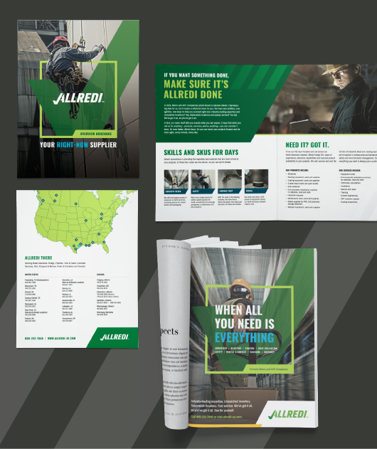
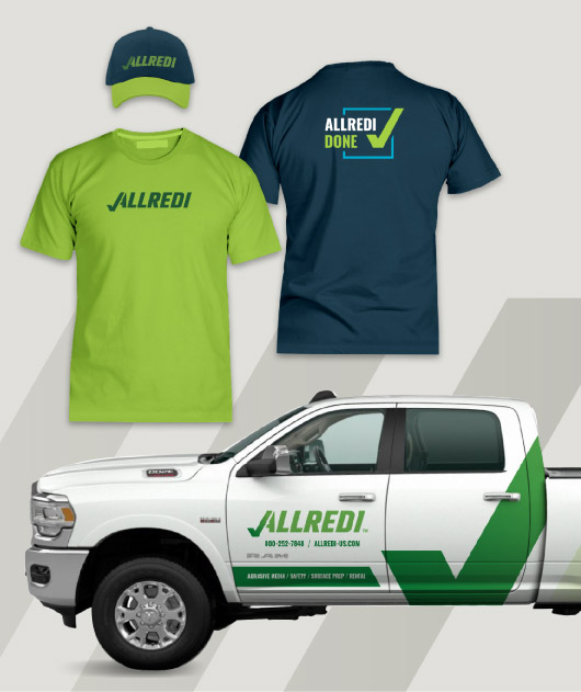
Inspired by the new name, we set about creating a completely new brand for the company. We developed a new logo and color palette based on a vibrant shade of green, a color neither legacy company had ever used. From there we designed graphic standards to guide every detail in using the brand across all print, locational and digital media, from typography to photography to tone of voice.


Allredi Successful
The launch was an absolute success. The new identity energized both workforces and fostered true belief that the merger would bring new pride, new agility and new opportunties to everyone at the company. BrandExtract continues to support Allredi as it charges forward into this new era. We’ve put in place a measurement program, conducting benchmarking studies to ensure the brand performs optimally as Allredi solidifies its dominant standing in the marketplace.
Results and Outcomes
300%
increase in social following
85%
participation at brand launch events
2 major companies
integrated to 1


