Podcast
The Keys to Building a Modern Brand with Chris Payne


The Keys to Building a Modern Brand with Chris Payne
Chris Payne is an award-winning designer who has worked with soccer clubs in both the U.K. and United States to help them launch or revitalize their brands. Chris joins the Solving for B° podcast to talk about fusing his passions to specialize in football design and why a cohesive, scalable identity helps brands build trust and brand believers.
Follow Chris on Twitter: @chrisypayne
See more of Chris' work: Website
Episode Outline
- The research and branding process (2:18)
- The discovery process and listening to key stakeholders (8:16)
- Why a cohesive visual identity is important for every brand (11:52)
- The biggest mistake clubs/businesses make with their brands (14:26)
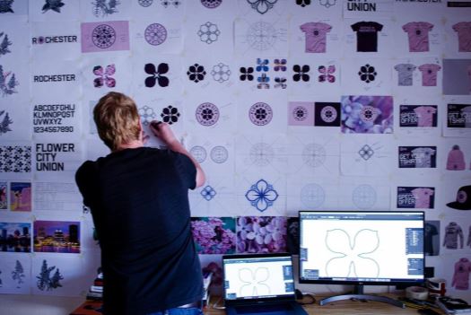
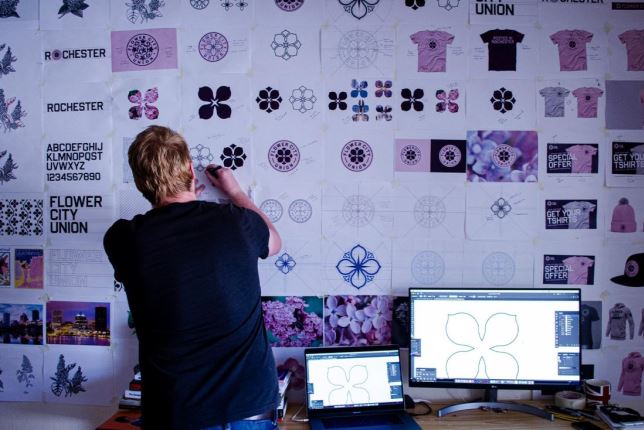
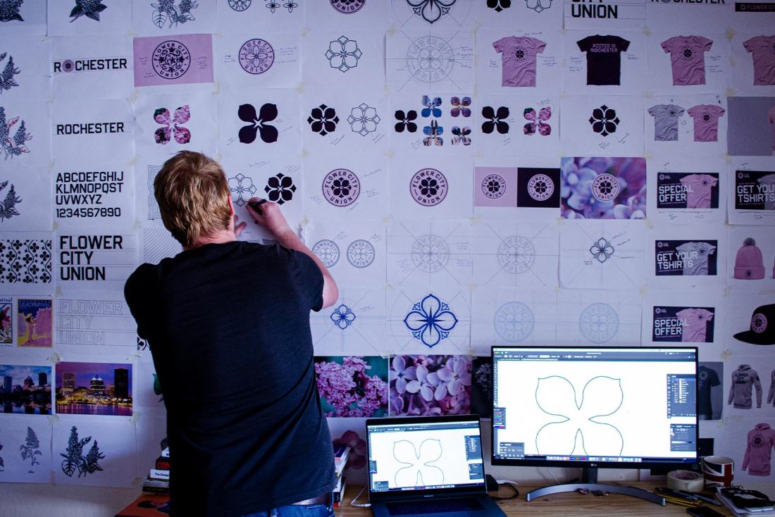
- Case study: creating the Flower City Union brand (16:51)
- Why clubs like Nashville SC stand out with their brands (25:36)
- How Juventus brought their brand into the 21st century (30:16)
- The keys to a modern, scalable brand (33:44)
**This transcript has been edited for readability

Kyle Smith: Hey everyone, I'm Kyle Smith and you're listening to Solving for B° with BrandExtract. This is the place where we cover all things, branding and marketing, digging into what it takes to build brands people believe in. So with us, I've got our Director of Digital Marketing, Chris Wilks on hand. And our guest on today's episode is Football Logo Designer, Chris Payne, who's worked with clubs across the world to develop their brands and visual identities.
Hey Chris, thanks so much for doing this. I'm really, really excited to talk to you and for our audience to hear from you as well. So let's dive in and start with your backstory. Give us the two to three minute version of where you came from all the way up to launching your company, Football Brand Designer.
Chris Payne: Two minutes. Let's see what I can do with it. So as you've probably already started to gather from the accent, I'm from England. I'm from a small little place called Derby in England, not very famous, but we do have a really bad football team who I support. Which is unfortunate because it's a roller coaster of emotions in Derby. But yeah, I grew up in Derby. Went to university in London, which was really nice, studied graphic design and advertising in London, always been a massive football fan. And when I say football, obviously I mean soccer. I come from a big footballing family, so growing up there was always a match on. I was always playing football. My brother played football, I play football, my mates play football.
And so that's always been instilled in me from an early age. And then when I realized I wasn't going to become a professional footballer, because that was the big dream like everybody. When I realized that I got some skills, but probably not enough skills, I then had to think, "Well, what am I going to do with my life? How I'm going to make some money?" And that's when graphic design kicked in. And that's when the love of being creative and the passion for creating interesting visuals and telling interesting stories and helping organizers grow through design. And so I've been a graphic designer for about 15 years. And then in the past five years, I've really focused on graphic design in the sports industry, particularly football/soccer.
The Research and Branding Process
Kyle Smith: It's cool to hear how there was this transition. So awesome to see that you're channeling that passion in the industry in just a little bit different way. So I'd love to chat about your process for branding. You did the recent launch of the club in my hometown Rochester, New York. Flower City Union got a really, really positive response from the community. I'm really excited to see it on the kits when the club actually plays its first match, I think 2022. What's your typical process for where you start when you develop these brands or rebrand as you do research and assessments? Walk us through what you typically go through.
Chris Payne: Well, it depends because each club is different, obviously you're dealing with different owners, different fan bases, different communities. And then also I worked with a lot of teams in England, but also teams here in America as well. And so typically with teams in England it’s not a new team that's starting up, it's usually a rebrand of a football club that has had a logo or a design for probably about a 100 years, typically because there's a lot of older teams in England who are now realizing that, "Hey, we're falling behind. We need to kind of catch up on our branding. Our logo, it obviously means a lot to the club, but does it work? Is it practical in today's digital world?" And a lot of them come to the conclusion that it doesn't, and so they look to simplify, but they still want to retain a lot of that history that the club has gathered over the years.
So with English clubs, it's more of a rebrand. It's just a bit of a different approach. We have clubs in America who are typically starting up, at the very start of their journey. It's a different approach because there's no football history, there's no the history of the town or the history of the city and the history of the community which should always be incorporated, but it's just a slightly different approach. But one thing that is consistent across both approaches is that it's always rooted in conversations between, well, I'd say conversation, but it's three parties who are involved, especially initially and all the way through actually.
So you have the owners of the club or the directors of the club. So a big conversation happens with them. It's about understanding their vision for the club, what they want to do with it. Which direction they want to go. Just questions about the tone of the club. Just really getting to understand what the vision is from the owner's perspective. The second party that's involved is the fan base, existing fans or new fans. This is kind of like the big group of people who you also have to please, so you have to please the owners, obviously, but you also have to please the fans and make sure that you're giving them something that they can have an emotional attachment with.
And then the third party is the designer himself, which in some cases is me, right? So with that, it's all about the designer's experience and his preferences and his aesthetic choices and knowledge and knowing what works and what doesn't work. So those three parties have to come together and then a lot of conversations happen to really kickstart the process.

Chris Wilks: Yeah. And I think it's really interesting, Chris, with the backdrop of what we saw over the weekend with admin Manchester of whatever ownership and the fan base are completely on opposite sides of the spectrum about what's important. So it's great. I think that you get the perspective of the fan base because one thing that we say here and that we always, we convey to our clients and anybody who will listen to us, is that you don't really own your brand, you manage it.
If you're the owner of the company of the club, you really are managing the brand because the brand exists in that relationship between the fans, even on a one-on-one level, what that brand means to those supporters at United, obviously, we can debate the merits of how they went about it, but there was a lot of passion behind what they wanted to see and felt was not being heard by ownership. So I think it's a great approach and glad to know that you're taking that all into consideration.
Chris Payne: Yeah. I think that comes a lot because of growing up in a football family. I'm a big football fan, so I feel it. It's an emotional thing. With football, you're selling emotions more than anything. People want to be a part of something. They want to be part of a movement. They want to enjoy the highs and the lows. Well, probably not enjoy the lows, but yeah, through the lows and we're all in this together type thing. And then when the highs do come, celebrate it. So it's a very emotionally charged industry and I think that's a part of the reason why I got into it eventually, so.
Chris Wilks: Yeah. And people identify so much to that point their identity in a lot of cases is tied to this brand. How many tattoos have you seen of crests of clubs and people wearing head to toe decked out in certain gear. I know from my own sports fandom, soccer, football, baseball, whatever it is, whenever someone kind of attacks your team or puts down your team, there's a resistance, there's some sort of emotional charge that goes through you that you're going to defend your team because you have that emotional connection. And that's what a good brand does, right? A good brand allows you to connect with that and that's really what we're looking for when we're developing brands. So yeah, I think the approach and the thought process just sounds really great from you, so I'm glad to hear that.
Kyle Smith: Well, I think more and more in today's culture too, there's an expectation for brands to stand for something, to be values driven too. People want to feel an emotional connection when they even make a purchase. And your brand being your reputation. And customer experience, I think, mattering more than ever. And I think some of that translates to what we saw over the weekend, how the ownership, the club are connecting with the customers, the fans.
The Discovery Process and Listening to Fans

Kyle Smith: So how do you talk to the fans? What's part of your research process to tap into that in a discovery? That's part of our process, doing interviews with customers. Do you do focus groups? What's part of your research so that you can tap into those fans and those emotions?
Chris Payne: I guess you could frame them as focus groups, but I like to call them more listening sessions, because it's a session where we speak to various people within the community where the football club is located, right? And then it's probably about an hour's conversation. Sometimes it's one-on-one, sometimes it's in a group and we ask them just a variety of questions. We show them symbols and we dig into what they like, what they don't like, what resonates, what they hate as well, stuff like that.
And we do this over and over again asking them why they're proud of the place where they come from, what they feel best represents the place that they come from, what are the people like. And then we also balance that out against data as well, because in some cases, a lot of clubs I work with have some data and some ideas towards what their target audience may be or what they presume that their target fan could be. Sometimes it's surprises along the way. But yeah, we have these listening sessions about an hour long, and then over time we probably do about between 10 and 20 of these with very diverse groups.
So it could be the local soccer teams in the area, or people who have an interest in soccer. It could be season ticket, deposit holders. It could be lifelong fans, for example, it's a team who's going through a rebrand. And then over time, what happens is you start to get a little bit of consistency in the answers. So the first listening session is like, "Oh, wow." It's a little bit overwhelming actually, because you get so many different answers. It's like, "Okay, I like this." And then another person would say, if it's a group setting, we'll say, "No, but I like this." There's so many answers coming in.
Then the more you do it, and the more you speak to people, and the more you dig in, you start to see a little bit of consistency in the answers. And that's when you know, okay, all right. Well, we could build a brand around this, right. We can ask some questions, not super direct questions, but open-ended questions where we can find out if it's a new club and new colors are going to have to be chosen. What are those colors? We don't ask exactly directly what it would be, but it's like, we can say, "When you think of your hometown, what colors do you think of?" Things like that. And we can really get under the surface of what people's feelings are. What certain aspects of what could make them a compelling brand.
Chris Wilks: That's awesome. So one of the things that stood out to me there, Chris and I think it's such a great approach because my thought would be, we'll just look at the flag of whatever town or whatever, right? My hometown it's like a navy blue kind of deal. But instead of just assuming, you go and say to your audience, "What do you think of this?" So you're drawing that connection to the important piece of the brand, as opposed to making those assumptions.
Why a Cohesive Visual Identity is Important for Every Brand

Kyle Smith: And that popped up in the launch video that you put together for again, Flower City Union recording some of the Zoom conversations with fans and lilac, lilac, lilac, a color that was pretty constantly mentioned and it lead to the final design, which again, looks really, really good.
I want to go back to what you mentioned earlier about going in and seeing some of these historic clubs realize they need to update their visual identities for a digital age. How do you consult them and why is a cohesive visual identity important for a club in the sports world or for any business?
Chris Payne: I think it goes back to trust. I think having a consistency with your brand shows that you are an organization that can be trusted, that it's the same voice speaking to you every time. Over time you get brand recognition and you can get really, really good when you take the logo or the crest out of one of your assets, but you still know which club it represents.
There's a few clubs who can do that, like Manchester United you can probably do that, you could probably put a shirt out there which is red, white, and black, and you probably instantly associate it with Manchester United. So that's been done. That exists because of years of consistency, right? A lot of clubs who I consult with and I work with, especially from England, they're coming from a 100 years of history and not too much brand management up until recently, because that's just the way it's been.
They usually have a very inconsistent style, lots of different visual elements. One week they’re using one typography, the next week they're using another one. And so it's not the same voice and it's not the same level of consistency. And so the end... I can understand, the fans will always be fans. They'll have that emotional connection, but when it comes to talking outside the fan group, such as sponsors or business partners, you really want to show yourself as being that consistent, that brand conscious football club because it helps, it helps with the trust. It helps with the organization.
And also a little secret for your, which you guys will know, but it's also very practical as well. If you're consistent it's practical. So you can create assets faster, you can put more content out there. You don't have to reinvent the wheel every time. There's a moment where you can be a little bit outside of the box, but generally you can be very efficient with your assets and you can continue with a very cohesive style, look and feel. And so yeah, you're able to put more assets out there. You may be able to do it faster and it's consistent and your brand just looks better for it.
The Biggest Mistake Brands Make: Trying to Please Everybody
Kyle Smith: Is there one mistake that you see clubs consistently make in terms of managing their visual identity or their brand? The whole idea of brand management is becoming more top of mind for these clubs. Do you come in and you pretty consistently see, "Hey, you need to address this issue."
Chris Payne: Pretty much. Yeah. There are a couple of things especially when clubs go through a rebrand and that's going to change the club’s crest or logo. Typically there is an urge or kind of an instinct to say, "Hey, let's put everything. Let's put every single thing that we can think of within the logo. Let's have this because it represents this part of the city or let's have this because it represents that part of the city." And you try and get all this hidden meaning in there and all these little Easter eggs in there.
But I would say that that's probably the wrong approach and I get where it comes from. You really want to please everybody, but ultimately you'll end up pleasing nobody, because it will look overcrowded and it won't be memorable. It stands a little chance of being iconic as the years go by. So I always come in and I say, "Look, it's all about simplicity. Resist the urge to have everything within the design of the logo, because the logo, I mean, it's a canvas. It's super small. It's really small. And when you've looked at it on social media where it's going to be seen probably the most it's even smaller.
So you really want to resist the urge to include everything within the design of the logo, but you can have those additional elements within the wider brand, right? So you can reference a certain thing in the brand pattern or in some club imagery, or in a secondary mark, or in other areas within the brand, but within the logo, keep it super simple, right.
Have a single point of focus, make sure... Some clubs don't even want typography within their logo and I say, "Look. Especially if you're a new club and you're trying to get established, you really want your name front and center because people want to see it and build up that brand recognition, they will see the symbol, but they really need to know who it represents.” So yeah, that's one of the things which I consistently see and I get where it comes from. That's probably one of the biggest challenges in going through the process. It's knowing what to leave out, as opposed to what to put in.
Case Study: Creating the Flower City Union Brand

Kyle Smith: Yeah. That's interesting. There's so much symbolism that you could include and it sounds like there's a lot of clamoring for that, but at the end of the day less is more, especially in a digital world, I guess. I'm not a designer, but minimalistic I think is... There's a shift to that. I think what you've put out recently in Rochester and then some of your other work reflects that.
I'd like to talk about a mini case study. It could be the launch in Rochester. That's a brand new club that’s starting something from scratch or another process where you guided a historic club through a rebrand. Could you walk us through a specific case and some of that process and the end result?
Chris Payne: Yeah, of course. So I'll talk about Rochester because it's obviously your heart and that is barely recent and I'm very proud of it. So the process was I actually worked with another team who play in the same league who were also in New York or in Manhattan, New Amsterdam. And so the ownership group at Rochester knew me because of my work I did at New Amsterdam which is a completely different brand with a completely different vibe. For example, New Amsterdam has got like this kind of antiestablishment kind of a little bit edgy, urban style brand. And then ultimately what we did with Flower City Union it's a lot more kind of optimistic right.
It's inclusive and it just takes on a very different vibe. So Flower City Union, they knew me because of what I had previously in the space. And so we set up a number of meetings just to discuss my process, to talk a little bit about how my third would be, all that kind of stuff. And so once everything was agreed and they told me I was the person to partner with for their brand.
Chris Payne: I also had a mini celebration because I was very, very happy to work with these guys because they are really, really nice people. But then we went through the process of the listening sessions. This is a new club, so it's a blank piece of paper. I like it that I've got some knowledge from what I hear from the ownership group and I understand their vision and I want to execute on their vision, but it's also important that I'm listening to the fans and I'm listening to the community.
So we set up a series of listening sessions, probably about 20 in total, various different groups. I asked a number of different questions but within each listening session, the questions were the same, so that I could kind of almost not turn it into data, but definitely see what answers were trending. And so throughout that process I found out many things about Rochester. One of the things that you'll know about this is Garbage Plates. I learned about that.
Chris Wilks: I had a feeling you were going to mention that.
Kyle Smith: Chris has heard about this for two years now. And at one point, I’m going to bring one down for you or whip one up, but yeah, a “delicacy” up in Rochester.
Chris Payne: Probably not so delicate from what I hear, but yeah, they tell me that I've got to get a few Genny beers and I got to try Garbage Plate. In fact, can I show you something?
Kyle Smith: Absolutely.
Chris Payne: So this is very important to the process. So this is the local beer from Rochester and I learned very early on in a lot of the listening sessions that Genesee Beer is something the local community are very proud of. I live in California and it's very difficult to get this. So I had to put a lot of money for this to come my way, but it was definitely worth it because this helps in the creative process and in the research process also. So yeah.
Kyle Smith: So you did all the consulting over Zoom, but you brought a little bit of Rochester to you in California.
Chris Payne: Yeah, I'm learning lots about Rochester. I would have liked to have gone to Rochester because, obviously speaking to people in person, maybe doing some listening sessions in pubs and things like that is also very interesting and brings up some interesting answers, but because of COVID and safety and all that the development of the brand was right in the middle of this pandemic. So unfortunately I wasn't able to, but I will get out to Rochester as soon as I can. And so, yeah, so that was one of the things that was mentioned, Genny Beer, Garbage Plates.

And then over time I kept on hearing all these mentions of Rochester been a very festival city. There's lots of festivals. Loads, and loads of festivals happening all the time and the biggest one is the Lilac Festival, which I'm sure Kyle, won't be news to you. And so digging into this a little bit more, I learned about Rochester is a place where lilacs flourish. And so I was very intrigued by this whole lilac theme, and then obviously the name, Flower City Union. That was already decided before I came into the process.
In the back of my mind, I knew with a name like Flower City Union, it would be odd to have anything other than a flower as the single point of focus for the brand. And so the question was quickly, which flower? And lilac was the very obvious choice. So not super challenging in terms of thinking of what that symbol would be.
I also learned that Rochester is a cold place, very cold most of the year, but when the flowers start to bloom and start to blossom, Rochester becomes a little bit of a happy place. There's a lot of optimism around because the cold days are gone and the good times are coming because the flowers are out, the festivals can start. People can start having a few Gennys by the river.
So that was an interesting thing. I liked the optimism that flower brings. So I wanted to incorporate that into the identity as well. And so with all this information, it probably takes around about two months to get all of the listening sessions done. But then while you're doing it, you're sketching, you're experimenting with ideas. You're looking at shape hierarchy life. We are to go for this lilac as the center point of the design, then what does the topography look like? Is it wrapped around? Is it a shield shape? Is it on top and then the lilac is on the bottom?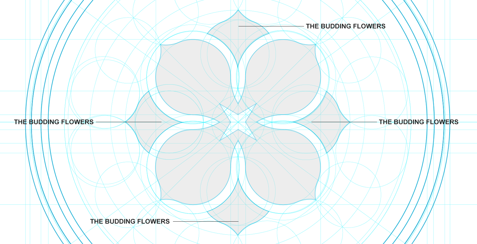
So you're assessing all of these things. And I don't go straight to the computer, I always use a pen and a piece of paper, so I can make some very, very quick designs and make some good designs, but also make some bad designs and move on really fast from them. So I do all that. And then once I find one which has got a lot of potential, I'm digging it.
And I like the fact that it's got a good hierarchy, it's simple, it's got a good symmetry. I always try and have symmetry within the design. I think that's important for club branding. I then move on to the computer and digitize it and go through the process of making sure that it's as perfect as it can be. And that can probably typically take three weeks to a month, lots of experimentation.
And then beyond that, you kind of looking at, "Okay, so this looks great as a standalone logo." You get to the point where you're fairly happy with it, but then you have to test it and you have to see what it looks like when it's really smallest like an icon on social media or massive as a signage outside the stadium. How does it look on merchandise? Because obviously this is football clubs, fans are going to want to buy the merchandise. Does it look good on hats? Does it look good on t-shirts, on hoodies.

You also think about the typography that you choose, can that be extended beyond the logo and using the wider brand for banner ads, for advertising campaigns, for typography on merchandise. How extendable could the brand be? Because you want to have the logo, obviously as the principal identity, but then just below that you want to have maybe a secondary mark or you want to have typography that can extend, or you want the colors to obviously be a big part of the story as well. And then also looking at brand patterns as well, which is something that a lot of clubs might not initially think of, but I think it's always advantageous to have a brand pattern which is derived from the the principal crest.
So in the case of Flower City Union, we've created this brand pattern which is... We created a couple of brand patterns actually, but one of the main ones they’re using at the minute is the shape of the lilac and it's just repeated over and over again, it just adds a little bit of a sort of texture. And so this goes back to what I was saying earlier about being practical with your brand, because Flower City Union have all these assets, they have this typography which is strong and recognizable.

They have the flower design, which is strong and recognizable, and now they have this brand pattern and you can put them all together in pretty much most formations and it will look good and it will be consistent. And so what that leads to is efficiency. So you can create assets faster and they all look good, and they're on-brand and they're consistent.
What Brand Stands Out in the American Soccer Landscape?
Kyle Smith: Who stands out to you in the American soccer landscape, in terms of having a really strong visual identity coupled with brand experience, because the brand goes beyond any visual identity. Like you said earlier, it's a key part of building that trust because the experience is so consistent over time. Is there any club that stands out to you at the moment doing a really good job of that?
Chris Payne: There's a couple in Major League Soccer, I would say... I'm really a big admirer of Nashville Soccer Club. When they launched their new identity, it was fairly controversial. A lot of people were like, "Okay, I don't quite get it." But they've really embraced the simplicity. And I think it's a clever design as well, because it's based on the vibrations of music and as you can see the shape of it as well, references a guitar or at least the top part of the guitar.
And I just really liked how they've extended their brand and how all their social media assets look. And the logo is almost like a brand pattern. They're very close to each other. So if you look at how they present themselves on social media with photography and just the visual aspect, you can tell that it's all derived from this very simple mark which is their logo. So I'm a big fan of what they're doing.
I admire that there would have been a lot of push for like, "Let's include everything. Let's include every single Nashville reference." I think it was done by Athletics of New York. They came up with something simple and it's proven to work. It really is. A logo is a symbol that represents, it doesn't need to tell the whole story. The brand can tell the wider story, and how you act, and how the club is portrayed every day, will tell that story. So the logo just needs to be simple. So keep it simple.
Chris Wilks: Circling back to your story about the process for the Flower City Union. One of the things I wanted to kind of point out to the listeners is that... I think there's a misconception when it comes to branding, is that we go into a lab or you go into a lab and you just kind of go away and do your work and there's this beautiful brand.
The brand and the essence and what it should be kind of presents itself to you. Right. You mentioned in your process, one of the things you heard... You knew it was Flower City Union, but then you also just kept hearing lilac, lilac, lilac. And it was like, "Well, yeah, it's going to be the lilac."
And that's frankly, in my opinion, and I don't know, you may disagree, but that's the way that it should happen. It should happen organically rather than me coming up with all these different things and trying to make it fit into the brand, as opposed to letting it kind of come up organically. But I wanted to kind of point that out to the listeners who may not quite understand, or maybe haven't as much experience with that and show that that's the way that should be done.
Chris Payne: Yeah. No, it absolutely is. You listen to the fans and they were saying lilac, lilac, lilac. But then also in the back of my mind was the ownership group who stated from the start that they wanted this club to be super inclusive, really optimistic. We've just come off the back of a really tough year, we want this club to be like a beacon of positivity. And so the colors like purple and lilac, they're bright and they're optimistic. And we have the budding flowers within the design.
So if you look at the design just next to the principal part of the lilac is these little kind of like budding things which are coming out and they represent the budding flowers. And that is just part of what the ownership group wanted in terms of being super optimistic. Yeah. They do come out... These brands are formed organically, and it's definitely not, as you say, in a lab for three months working independently, and then. There's definitely a lot of collaboration between all parts.
Bringing a Historic Club into the 21st Century: The Juventus Rebrand
Kyle Smith: I like what you were talking about with the Nashville logo, which I think it got some mixed reactions initially, but like you said, they’re being so consistent in sustaining this over time that I think there's this evolution where it is connecting with people. There is the “less is more” approach where it's working. It made me think of an example of a historic club, Juventus, they had their rebrand a number of years ago, which was very controversial. I think their approach was really trying to emphasize a brand experience like being a lifestyle brand more than just a football club.
I would love to know your thoughts on their approach. You obviously work with some very historic clubs and Juventus is right up there in those conversations, but I don't know how much they engaged with their fans before doing that. It seems to be paying off though. What are your thoughts on how they did that and how they're managing their brand?
Chris Payne: Oh, it's amazing. Honestly, it's like it was so bold at the time. I was like, "Oh, wow. That is bold." But it's actually really intelligent, super intelligent if you look at it because you might look at it and think, "Okay, well simple means that it was done in five minutes." But it's definitely not the case, especially with Juventus because the more you look at it, the more you see. So obviously you have the J, Juventus in there. You also have the stripes, you think of Juventus, you think of Del Piero wearing the stripes. You think of Zidane wearing the stripes. All these classic players and that the stripes, that's what makes Juventus.
Newcastle fans might argue that they own the black and white stripes, but Juventus... Well. Notts County as well, a team in England who originally actually gave... Notts County originally gave Juventus their stripes because they went over to Italy to play a friendly back in the day, a long time ago. And Juventus apparently didn't have any kits or something like that, so Notts County gave them their black and white striped kits to play a game, and then they adopted it ever since.
Yeah, when you think of Juventus, you think of the stripes and that's included within the very, very simple design of the Juventus logo. Also, you look really closely and you see a football kicking a ball, the position of the J and then the top part of the J, it just looks like a footballer getting ready to strike the ball.
Yeah, I was a big fan when it first came out. It was obviously very controversial, especially with a lot of traditionalists, but I completely get where they're going with it. And it wasn't just the launch of their logo, obviously that was front and center, but they also have this custom typographic as well, which came with the logo, which took on some stylistic characteristics of what the logo has as well.
So they did a really good job, a lot of photography in black and white. They're really embracing what is true to their brand, which is the black and white color scheme. Yeah. No, I loved it straight away, but I knew that it would be a split audience in terms of like, "Do we like this? Do we not?" And I think most people will look at it now with the gift of hindsight and go, "Okay, all right. Yeah. They're more recognizable." I know their new logo now more than I remember their old logo.
Kyle Smith: That one's so fascinating to me because can you imagine Liverpool or Man United, where you have so much equity in something that's so recognizable and Juventus had that, but they said, "We're going to be really forward-looking to create this identity that transcends just what's on the pitch." I guess. The lifestyle, the brand experience stuff, and they just committed to it top to bottom and I think it seems to be paying dividends.
The Keys to a Modern, Scalable Brand
Kyle Smith: Maybe this is a good question to tie everything together and wrap things up Chris. What do you think are the keys to building a modern scalable brand? Juventus committing to that. What are universal principles that you think are really important for any club or brand to consider?
Chris Payne: Obviously listening to the fans. We spoke a lot about that. Listening to the fans is very important. Make sure it's representative of the place and the people that the club represents, but at the same time, simplicity as well. Especially when we're talking about the design of the logo, definitely go for as simple as you can make it.
There's a fine balance between getting enough references to make it stand out and make it be unique, but you also need to keep it pretty simple and let the wider brand tell the story. And that's another principle as well, storytelling within the brand, the visual language of the brand. How does it reference the place in the community?
Just a quick example, I worked with a team in England called Eastleigh. This is the place where the Spitfire was manufactured and invented, and the community are very proud of that. Like really, really proud of the fact that that was the birthplace of the Spitfire. It was considered an engineering feat by the local community and the rest of England as well.
So when I was going for the rebrand of Eastleigh, their nickname is the Spitfires because that's the place where the Spitfires came from. And with that, we created a custom typography, custom typeface for the club, which is based on the markings on the side of the Spitfire. And so that's just a little bit of what I'm referencing when I'm talking about telling a story with your brand and creating a visual language.

So that would be another go-to for me. I would say also passion, make sure you care about it as well, because one of the reasons why I got into football brand design is because I care about it. And I feel as if I am in many ways, embodying the fans of the club because I'm a football fan myself. I understand the emotions of supporting a football team. And so I got into it because I really wanted to fuse my two passions, one is design and the other one is football. And so by creating brands for football clubs, I was able to do that.
This isn't something that the people can adopt. I think it's just something that comes naturally. I think it's just part of you like football is part of me. Each and every design that I do is fueled by passion and fueled by desire to work hard and do the best and give the club the best possible chance of being successful with their brand. So yeah, that would be one of the key go-tos for that.
See more of Chris's work: Website
Join our mailing list
Meet the Authors